The “Red” vs. “Blue” Crime Debate and the Limits of Empirical Social Science

Photo: DNY59 / E+ / via Getty Images
For the past two years, several think tanks on opposite sides of the political divide have waged war over whether “red” or “blue” America has a worse crime problem. Commentators on the left have pointed out that red states have higher homicide rates than blue states, while those on the right have noted that the relationship is more nuanced and can easily flip at a more local level: red-state crime problems are often concentrated in blue cities, and red counties have lower murder rates than blue counties.
In this brief, we do two things.
First, we highlight this debate as an example of how seemingly minor research decisions—such as whether to analyze data at the state or at the local level—can drastically change results. If we look at the county level, Democratic areas seem particularly murder-ridden; but when we look at the state level, Republican states are clearly more violent. Casual consumers of empirical social science research often fail to appreciate all the ways in which researchers can manipulate the data to say whatever they want.
Second, we want to move the debate forward by showing how the correlation between crime and partisanship changes after adjusting for differences in social characteristics that could affect both crime rates and partisanship, such as the age, income, and racial composition of the region. Previous analyses have sometimes noted the importance of these potential confounders, but few have addressed the problem clearly and compellingly.
The upshot is that models with control variables—in other words, models that compare states or counties with roughly similar demographic and economic characteristics—tell a much less spectacular story than those without. In fact, by adjusting for differences in basic demographic and economic characteristics, we can easily make the red–blue difference in homicide rates disappear. Perhaps further research with more advanced and complex designs could make additional progress on the question. However, given the sensitivity of the conclusions to how the researcher chooses to analyze the data, we suspect that such effort would be better spent studying and debating concrete policies, as opposed to figuring out which political party has the most violent constituents.
The Debate Thus Far
In 2020, amid a pandemic, the murder of George Floyd, and the massive protests that followed, the U.S. homicide rate rose about 30%. It climbed even higher in 2021. In the most recent data available, covering 2022, homicides have declined significantly but remain above their 2019 levels.[1] Conservative politicians were quick to blame the increase on various progressive policy proposals, including the “defund the police” movement, progressive prosecutors, and other efforts designed to make the justice system less punitive, thereby increasing incentives for criminal activity by reducing the punishment for such activities.
A major part of the left’s pushback to this narrative focused on state-level homicide rates. Specifically, reports from the think tank Third Way in March 2022[2] and January 2023[3] documented that red states (defined as those where Trump won in 2020) had a higher combined homicide rate in every year going back to the beginning of the century. The reports fingered gun policy as a likely culprit, along with poverty, education, and funding for government services, including police, as Democratic governments tend to pay public servants more. California governor Gavin Newsom highlighted these talking points, with his office repeating the comparison in a report touting the state’s gun laws.[4]
In response, right-leaning commentators pointed out that because policing and prosecution are handled primarily at the local level, analyses of state-level homicide rates didn’t tell the whole story. Our Manhattan Institute colleague Rafael Mangual showed that red states’ homicide rates often drop significantly when Democratic-run cities are dropped from the numbers.[5] Christos Makridis and Robert VerBruggen (coauthor of this brief), looking at the increase in homicide between 2020 and 2021, found that Democratic vote share predicted higher homicide rates and larger increases in that period, though the relationship was insignificant in more comprehensive models.[6] A RealClearInvestigations article coauthored by the Crime Prevention Research Center’s John Lott also focused on county-level data, finding that Biden-won counties have higher murder rates.[7]
In October 2023, the conservative Heritage Foundation and the liberal Center for American Progress (CAP) Action Fund weighed in. The Heritage Foundation showed that “the homicide rate has been higher in Democratic-leaning ‘blue’ counties than in Republican-voting ‘red’ counties since 2002.”[8] CAP Action took a particularly innovative approach, comparing large cities located in blue vs. red states and confirming that these cities were similar on numerous variables. However, the key “racial diversity” control was defined only by the white percentage of the population, despite sizable differences in homicide rates across various nonwhite groups. The report also counted only gun homicides, as opposed to all homicides, and used data from the private Gun Violence Archive rather than an official source. It concluded that red-state cities had higher rates of gun homicide, larger increases in gun homicide from 2018 to 2021, and smaller declines in 2022 and as of October 2023.[9]
The following month, Mike Males of the Center on Juvenile and Criminal Justice, analyzing CDC data, somewhat unconventionally contrasted “1,071 rural and small-town counties in the 23 conservative states (defined as those governed by Republican governors and legislatures)” with “92 urban counties containing large cities in the 15 liberal states (ruled by Democratic governors and legislatures)”—finding that the former had historically been safer but had experienced higher homicide rates most years since 2018.[10]
Additional Analyses
We come not to resolve this debate but to point out that in many cases, very much including this one, data can say whatever a researcher wants them to say. Not only the unit of analysis (county vs. state), but decisions about whether and how to incorporate control variables have a profound effect on the results. Both at the county and at the state level, adding basic control variables makes the red–blue difference much smaller.
We use publicly available data throughout so that our results are easily replicable. The homicide data from the Centers for Disease Control and Prevention run from 2018 to 2022, tallying killings by where they occurred (as opposed to where the decedent resided);[11] the demographic variables come from the 2020 decennial census;[12] and the 2020 two-party vote shares come from MIT Election Labs.[13] Because homicide data are often missing in smaller counties, we restrict the data for the county-level analysis to larger counties with population of at least 200,000 persons (which contain about two-thirds of the U.S. population and three-quarters of all homicides). For the state-level analysis, we removed Washington, DC, which is an enormous outlier in its homicide rate and is a city rather than a state.
Table 1 shows the upshot of our analysis. For simplicity, we’ve calculated the effect of a 10-percentage-point increase in the Trump share of the vote in the 2020 presidential election. The underlying regressions are weighted by population, so larger states and counties play a larger role.
Table 1
Effect of 10-Point Increase in Trump Share on the per-Capita Homicide Rate
| Variables in Model | County Level | State Level |
| No Controls | –14%* | +25%* |
| Race, Age, Gender, Urbanization, and per-Capita Income | –0% | –3% |
*Considered statistically significant at the conventional (5%) level
In analyses with no control variables, the much-discussed previous results are apparent: blue states are safer than red states, yet blue counties are more dangerous than red counties. But the numbers change dramatically when we adjust for demographic differences across regions. In particular, the second row controls for the shares of the population that are male, black, Hispanic, and Asian; for the percentage of the population that is urbanized; for the share of the population that is aged 15–24 and 25–34, as well as black males in those age ranges; and for per-capita income. Once we adjust for these demographic and economic differences, there is no relationship between the Trump share of the vote and homicides at the county or at the state level.
Of course, these two configurations of the model only scratch the surface of the possibilities, and one might reasonably justify any number of additional (or fewer) controls. The point is not that any particular model is the right one but that confounding factors obviously drive a lot of these gaps in violence, and subjective decisions about how to address that fact can make the data say different things.
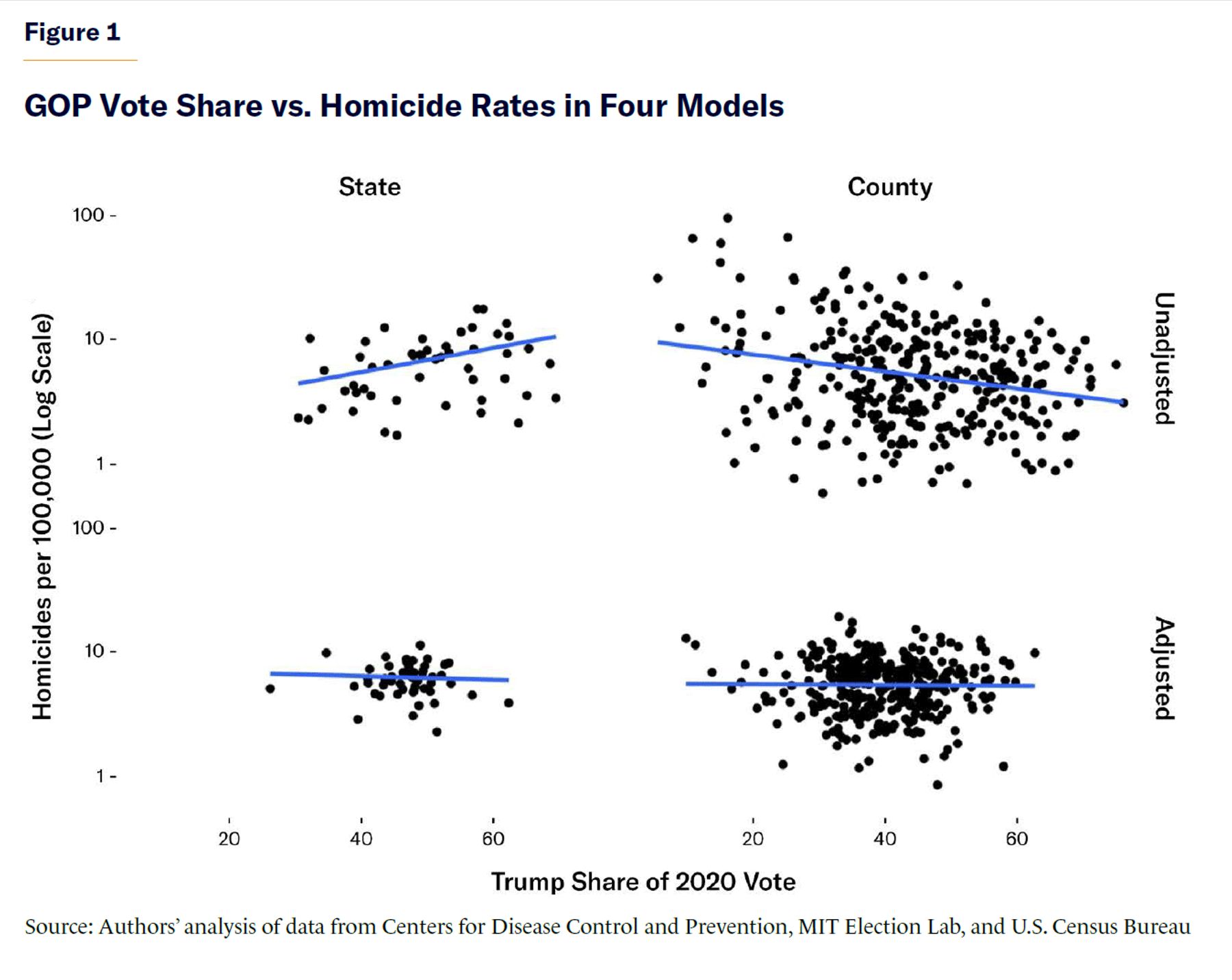
Figure 1 is a graphical depiction of how the choice of the unit of analysis (state or county) and statistical adjustments dramatically alter the results. In the top row are the raw relationships between GOP share and homicide at the county and state levels. The raw data clearly depict both the positive correlation between red states and homicide rates and the negative correlation between red counties and homicide rates. In the bottom row are the full models with demographic and economic controls. Once we compare states or counties that are roughly similar in terms of their age distribution, race distribution, urbanization, and per-capita income, there is no correlation whatsoever between the Trump share of the vote and homicide rates.
Conclusion
Of course, one could take this analysis much further, opening many more opportunities for clever decision-making in research design. One can, for example, control for even more detailed demographics and economic features across regions. One can experiment with different data sources and different homicide measures. One can try to measure cultural differences as well, given that regional differences in violence go back to the Founding Era. One can even treat elections as “natural experiments” and measure the effect on crime when various levels of government change hands. Our analysis, however, makes a very simple point: it is very easy to change the conclusion by manipulating the data in very simple ways. Increasingly complicated analyses will not get rid of this fact but instead will open even more opportunities for manipulation. In a very real sense, the sign and magnitude of the correlation between the Trump share of the vote and violence ultimately depend on whatever the researcher wishes to do with the data.
It seems to us that it would be far more productive to spend that time and effort debating the merits of actual policies, as opposed to measuring the effect of partisan leanings in the population. Democrats say that lax Republican gun laws drive up murder; Republicans say that Democratic mishandling of policing and prosecution is what really matters. Though our cross-sectional data are not suited to studying these hypotheses—for one thing, police staffing and gun ownership can change in response to crime, in addition to whatever effect they have on crime—there are large and important academic literatures on both topics.
Let’s have those discussions, rather than interminably going back and forth over whose constituents are more violent. The U.S. certainly has more than enough murders to go around.
Endnotes
Photo: DNY59 / E+ / via Getty Images
Are you interested in supporting the Manhattan Institute’s public-interest research and journalism? As a 501(c)(3) nonprofit, donations in support of MI and its scholars’ work are fully tax-deductible as provided by law (EIN #13-2912529).