Breaking Down the 2020 Homicide Spike

Photo: 400tmax/iStock
Introduction
In 2020, amid the outbreak of the Covid-19 pandemic and the protests and riots surrounding the death of George Floyd, America’s homicide rate increased by an astonishing 30%, even as many less serious types of crime held steady or even declined.[1]
The purpose of this brief is to describe the people and the places most affected by the explosion of lethal violence. Using data on homicides from hundreds of the nation’s largest counties, we analyze various demographic characteristics of victims, as well as the geographic correlates of the spike in violence.
Homicide increased for almost everyone in 2020, but it did not increase for everyone equally. Tragically, the demographic groups that started out with the highest homicide rates also saw the biggest surges. Although we need more data to say definitively, we find some evidence that suggests that the nation’s political cultures played a role, with homicide increases in GOP-leaning counties tending to be smaller than those in Democratic-leaning counties when we focus on homicides within counties over time. We also find that there is no statistically significant relationship between the growth in the homicide rate and either the number of Covid-19 deaths or the number of guns sold per capita.
Data and Measurement
To measure homicides, we rely primarily on mortality data from the Centers for Disease Control and Prevention (CDC). While this includes justifiable homicides in addition to killings legally considered murder or manslaughter, and while some deaths are erroneously classified as homicides (including some gun accidents[2] and police shootings, the latter of which should be classified as “legal interventions”), the CDC’s death-certificate-based numbers are far more comprehensive than the data from the FBI. The CDC has “essentially full coverage”[3]; the FBI’s national numbers are drawn from reports voluntarily submitted by police agencies and statistically adjusted to account for underreporting.[4]
Importantly, the CDC data provide demographic information for the deceased and can be broken down by county, which allows us to analyze the geographic correlates of the crime spike. The data for 2020 were finalized late in 2021, though we make also make some use of “provisional” data running through part of last year.
An important limitation of the county-level CDC data is that death counts below 10 are suppressed for privacy reasons. Thus, numbers for the smallest counties are missing—and data for somewhat larger counties are selectively missing depending on whether these counties’ homicide rates are high enough to put them above the threshold of 10 killings. As a result, we obtain roughly 290 counties with complete data in 2019 and 2020. Although that is only a fraction of the total of nearly 3,000 counties, it constitutes 58% of the population. Furthermore, crime is concentrated in these densely populated counties.[5] When we restrict our analysis to only large counties with over 300,000 people, the results are nearly identical.
We nonetheless acknowledge that there could be discrepancies between the actual state or county levels of crime and the reported quantities in the CDC.[6] However, we believe that it is better to conduct a sophisticated analysis on a smaller sample than a crude analysis on a larger sample: data quality matters.
Our geographic analysis makes use of variables from several other sources. We draw on the American Community Survey five-year sample between 2015 and 2019, giving us a wide array of demographic factors for each county, including the distribution of gender, marital status, race, education, and median household income. We also use the Quarterly Workforce Indicators to control for year-to-year employment growth and more recent data from the Census Bureau to control for year-to-year population growth.
Lastly, we have a measure of gun sales in 47 states from the National Instant Criminal Background Check System (NICS). Alaska, Hawaii, and Michigan are excluded for data-quality reasons[7]; D.C. is excluded because it is a city rather than a state, and it is in a unique position in terms of local gun sales.[8]
The Extent and Timing of the Homicide Surge
The national homicide rate spiked dramatically in 2020, a change obvious both in the CDC data and in the numbers from the FBI. (The FBI measure tends to be a bit lower, in part because it includes only criminal homicides[9]; for example, it excludes those deaths from 9/11 from the homicide rate in 2001.) As shown in Figure 1, the rate reached its highest level in roughly a quarter-century—though even higher numbers were recorded routinely before the great crime drop of the 1990s. If the homicide rate had remained the same between 2019 and 2020, more than 5,000 additional Americans would be alive today.
Figure 1
U.S. Homicide Rate by Year

Much attention has been paid to whether this increase was driven by the pandemic and lockdowns or—in an echo of the “Ferguson effect” debate from half a decade ago—by the summer protests and unrest, which could have led to depolicing. Homicide rates early in 2020 were slightly above 2019 levels—and the gap widened in March and April, before the murder of George Floyd in May—but violence truly exploded in the summer (Figure 2).
Figure 2
U.S. Homicide Deaths by Month, 2019–2021

As the provisional data from the early months of 2021 show, the increase persisted beyond the end of the year. Another analysis, relying on data from big-city police departments, suggests that homicide rates in 2021 as a whole were even higher than they were in 2020.[10]
Demographic Patterns
Homicides went up throughout the country, and for every major demographic group, in 2020, but they did not rise for everyone equally, as is clear when we break down the numbers by race, age, sex, urbanicity, and region of the country.
In making such comparisons, it’s important to understand two different ways of measuring such changes. Imagine that one group has a homicide rate of 1 per 100,000, while another group has a rate of 5 per 100,000. If those rates rise to 2 and 10, respectively, both doubled proportionally—but in terms of human costs, the second group was far more affected, with 5 extra deaths versus 1 for the group that started out with a lower rate.
This, tragically, is the pattern we see in the homicide data from 2020. Looking across various groups of Americans, there are relatively modest differences in terms of how much homicide increased proportionally; most of the increases fall in a range of about one-fifth to one-third. Far more dramatic, however, are the differences in the human toll of those increases, thanks to preexisting gaps in homicide rates that the 2020 spike exacerbated.
The racial and ethnic breakdown is perhaps most striking in this regard. Proportionally, homicide rates rose by about 34% for black Americans and about 19% percent for non-Hispanic whites: a notable, but not extreme, gap (Figure 3). But since the black homicide rate was already many times higher than the white one, this translated into 8 additional black deaths for every 100,000 population—an increase similar to the total homicide rate for the country as a whole—while the death rate for whites rose by only 0.5 per 100,000. (Recall that these numbers pertain to the homicide victims, not the killers, though American homicide is overwhelmingly intraracial.)
Figure 3
Homicide Rates by Race and Ethnicity

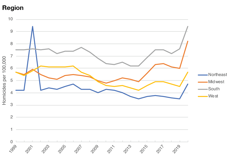
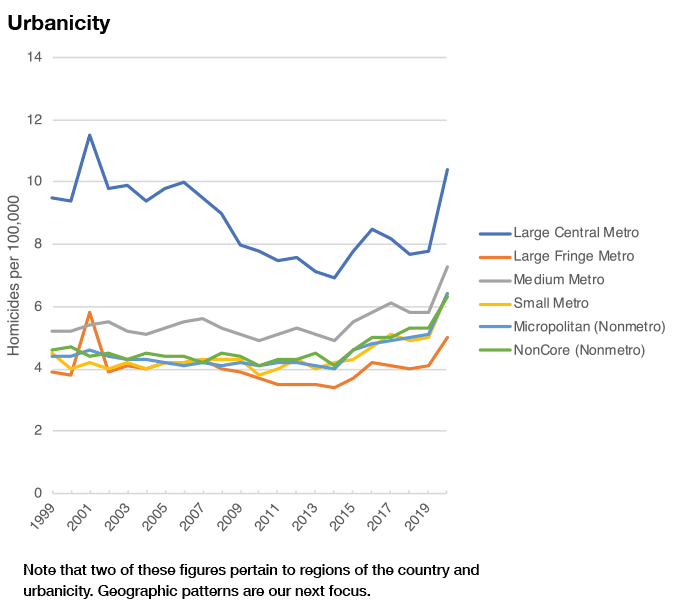
The same concept can be seen in other demographic categories, as shown in Figure 4 below. Groups that had higher homicide rates in 2019 tended to have reasonably similar proportional increases but substantially bigger raw increases in 2020. When homicide rates rise, the groups that were already most vulnerable to violence pay the price. (Recall that the 2001 spike in the figures below reflects those who died on 9/11.)
Figure 4
Homicide Rates by Assorted Demographic Characteristics:


The Geographic Correlates of the Crime Spike
Before exploring the correlation between geographic factors and the growth rate of homicide rates per capita, we begin with a visualization of differences across states. Panel A in Figure 5 plots the homicide deaths per capita (death rate) in thousands (averaged between 2019 and 2020), showing that the highest death rates are concentrated in the South. However, Panel B shows that the greatest increase between 2019 and 2020 is concentrated in the Northeast.
Figure 5
Spatial Heterogeneity in Homicides Across States

Next, we explore the correlation between two geographic factors—population and GOP vote share—and the growth rate in the homicide rate per capita between 2019 and 2020. Each observation is a county whose size is determined by its population, giving larger counties greater weight. Counties with a higher share of GOP voters not only have lower homicide rates but also a lower growth in homicide rates between 2019 and 2020 (Figures 6 and 7).
There is a positive correlation between population in a county and the growth in the homicide rate, but the correlation between population and just the homicide rate is slightly negative (Figure 8). In this sense, even though there are slightly higher rates of homicide deaths per capita in smaller counties, some of those differences could be driven by spurious factors that are correlated with population.
Figure 6
GOP Vote Share and Homicide Rate Growth

Figure 7
GOP Vote Share and 2020 Homicide Rate

Figure 8
Population and Homicide Rate Growth

We also examine the correlation between the unemployment rate and the growth in homicides at the county level (Figure 9). We exclude January, February, and March and focus on the remaining months of the year in 2020. Consistent with recent evidence in the Journal of Urban Health finding that worsening of economic conditions was correlated with an increase in violence, we also find a 0.15 correlation.[11]
Figure 9
Unemployment and Homicide Rate Growth

Finally, we examined the relationship between homicide increases and gun sales at the state level. There was a negative correlation between the growth in the gun rate from 2019–2020 and growth in the homicide rate, but a positive correlation between the homicide rate and the rate of gun sales in 2020 (Figures 10 and 11.)
Figure 10
Homicide Rate Growth and Gun Rate Growth

Figure 11
Homicide Rate and Gun Rate

Multivariate Statistical Models
While the analysis to date presents bivariate correlations and time series patterns on the incidence of crime, specifically homicides, one concern is that we are overlooking heterogeneity in potential unobserved factors. For example, counties with higher crime rates (or larger increases in the crime rate) might also have more lower-income households. Indeed, Table 1 regresses the log number of homicides and the growth rate on the 2018–2020 data on a range of demographic characteristics, showing that median household income and race distributions are correlated with homicide deaths. Population growth tends to be negatively correlated with homicides, but not all specifications are statistically significant.
Table 1: Demographic Correlates of Homicides in 2019 and 2020

To overcome these concerns, we pool our two years of data for 302 counties and estimate multivariate regressions. We examine models with two different outcome variables—the log number of deaths due to homicides and their year-to-year growth rate. We regress these outcomes on an indicator for whether the year is 2020, together with demographic and county controls.
First, we control for year-to-year population and employment growth, which addresses the concern that areas with higher homicide rates are simply those that may have seen bigger declines in their population and employment. We also control for the number of guns per capita, as well as the log number of Covid-19 cases and deaths. These address the concern that we are detecting an increase in violence due to guns and/or a heightened risk of transmission and mortality from the virus that may have led people to become more violent. Finally, we control for a wide array of demographic controls—log median household income, as well as the age, gender, race, and education distribution—to purge variation that may arise from different local preferences and/ or knowledge stocks and capabilities.[12]
Table 2 now documents the results with Equation 1. Starting with columns 1 and 3, we see that 2020 exhibited 24.5% more homicide deaths, relative to 2019, and a 26.4 percentage point (pp) faster growth rate of homicide deaths relative to 2018–2019 growth. As we explained earlier, however, these raw correlations could be spurious. Columns 2 and 4 layer a wide array of demographic controls using the 2015–2019 American Community Survey. The resulting marginal effects decline slightly to 22.9% and 20.9pp, respectively, after the inclusion of these controls. That is consistent with the presence of upwards bias—that is, higher crime areas in 2020 are negatively selected.[13]
Of note, population and employment growth are statistically unrelated to the level and growth in homicides when we control for demographic factors. (If we do not control for demographics, both enter in highly statistically significant ways, consistent with our concern that demographic factors are important to control for to mitigate spurious correlations.) Moreover, if we instead use the 2020 unemployment rate as a control, rather than the 2019–2020 employment growth, we obtain slightly larger coefficient estimates on our indicator for 2020, in part because of a larger sample.
We also see a strong negative correlation between median household income and the number of homicides, but no correlation with the homicide growth rate. Furthermore, we see that Covid-19 deaths are slightly negatively correlated with the number of homicides but not statistically related to the homicide growth rate, which underscores that the rise in crime cannot be explained by Covid-19. In sum, the overall invariance of our estimates to the inclusion of these controls suggests that we are obtaining a genuine causal effect rather than a spurious one.
Table 2: Evaluating the Changes in Homicides Over Time Across Counties

An additional concern is that we are still failing to control sufficiently for county-specific factors. In Table 3, we interact county-level factors with our 2020 indicator and control for both county and time fixed effects, comparing counties that vary in some capacity over 2019 to 2020. We focus on three factors: the 2016 GOP vote share, the 2015–2019 share of bblacks, and the 2015–2019 log median household income. Unfortunately, our small sample of counties means that we have limited variation, but these results nonetheless highlight three interesting results. First, counties with higher 2016 GOP vote shares have lower levels of homicides and a lower growth in homicides from 2019 to 2020. Second, counties with higher median household income have a slightly higher level of homicides but a lower growth rate, although these estimates are especially statistically noisy. Third, counties with higher shares of blacks have slightly higher levels of homicides but a lower growth in homicides.
While we caution that these estimates are statistically insignificant at conventional levels and are based on a limited sample of counties, we also conduct additional diagnostics using additional specifications. For example, we use homicide deaths per capita as an outcome. Furthermore, to better fit the distribution of homicide deaths, we use a Poisson estimator instead of ordinary least squares. These results are reported in the appendix, showing that each of the interaction effects are not statistically significant at conventional levels. Nonetheless, to avoid any perception that we are cherry picking our results, we retain the baseline specification.
Table 3: Examining the Role of County-Specific Heterogeneity

Next, we replicate all our results at the state level. One concern is that our results reflect a small subset of counties that are not representative. While we have explained our sample selection and caveated it, we nonetheless reproduce our main results in Table 4. Importantly, we see that the raw correlations change only minimally. For example, in 2020, there were 23.2% more homicides and a 23.2pp higher growth in homicides. When we control for state-level demographic factors, the former coefficient declines to only 17.7%, and the latter rises slightly to 24.7pp. In both cases, we cannot statistically distinguish them from one another.
Table 4: Evaluating the Changes in Homicides Over Time Across States

Of note, we also include the number of guns sold per capita. While we see a positive coefficient in column 2, it is statistically insignificant. Moreover, we see a negative coefficient in column 4. Even if the results were statistically significant, these results suggest that any increases in the number of guns sold per capita are negatively, not positively, associated with the rise in homicides in 2020. In fact, if we interact the 2020 indicator with guns per capita and include both state and year fixed effects, the interaction effect is negatively associated with both outcomes, although it is statistically insignificant.
Discussion and Conclusion
There is still much to be learned about why homicide began to increase in 2020, but the data reviewed here make a few things clear. First, homicides indeed rose substantially, and the increase disproportionately affected the people and groups who had already been at the highest risk of violence.
Second, the increase cannot be explained by other confounding effects, such as the presence of Covid-19 or a change in the number of gun sales. No matter how we cut the data—whether by county or state, or whether we control for a wide array of demographic and economic factors—we continue to see over a 20-percentage-point increase in the growth rate of crime in 2020, relative to 2019.
Nonetheless, our results leave several questions open for future research. For example, how might the results change if we measure crimes other than homicide? Similarly, how might the results change when a larger sample of counties are available to conduct inference on? While we do not believe these changes would qualitatively alter our results, future research along these lines remains important. We also believe it is useful to continue tracking the dynamics of crime across counties and study how they evolved in 2021.
Appendix
Table A1 reports the results associated with our tests for heterogeneous treatment effects using the homicide death rate as an outcome variable, and as the number of homicide deaths (using a Poisson estimator). Here, we find that counties with higher shares of GOP voters have a much lower homicide death rate and a lower number of deaths in 2020. We also find that differences in race are statistically significant when the outcome variable is the homicide death rate, but these are not as conclusive and may reflect other confounding factors. Furthermore, we see that areas with higher median household income also have lower homicide death rates.
Table A1: Alternative Empirical Specifications with County-Specific Heterogeneity

Endnotes
Photo: 400tmax/iStock
Are you interested in supporting the Manhattan Institute’s public-interest research and journalism? As a 501(c)(3) nonprofit, donations in support of MI and its scholars’ work are fully tax-deductible as provided by law (EIN #13-2912529).