Spike and Recovery Homicide in Big Cities, 2018–23

Photo: FireAtDusk / iStock / Getty Images Plus
Introduction
Nationwide, homicide surged in 2020 and 2021, before slowly decreasing over 2022 and 2023. It is crucial to understand the dynamics driving this change, so that policymakers can prevent conditions conducive to such surges and can gain a stronger understanding of what drives crime in general.
Using a mix of data sources—including the Real-Time Crime Index[1] from AH Datalytics, the FBI’s Uniform Crime Reports,[2] and the CDC’s mortality records[3]—this issue brief details how the nation’s largest cities fared during three periods, dubbed the Baseline (2018–19), the Spike (2020–21), and the Recovery (2022–23). It identifies several municipalities that stand out and patterns correlating with other variables such as police-staffing and unemployment levels.
A major finding is that the cities with the highest initial homicide rates saw the biggest spikes in per-capita terms, just as the demographic groups with the highest initial homicide rates saw nationwide. However, when homicide-rate changes are viewed in proportional terms to take account of this—in other words, treating an increase from 4 to 8 per 100,000 as similar to an increase from 8 to 16 per 100,000, as both represent a doubling—the emerging patterns are more subtle. Nonetheless, I do find some correlations consistent with the theory that both policing and unemployment affect homicide surges.
A Refresher and Update on National Trends
Figure 1 depicts the monthly homicide count for the entire U.S. from 2018 through mid-2024, drawn from the Centers for Disease Control’s publicly available data based on death certificates. At the beginning of this period, the U.S. homicide rate was at a low ebb, below its minor peak in the mid-2010s, and far below the homicide rate that the U.S. suffered circa 1990.
A year-over-year comparison reveals that 2020’s spring months, during the earliest stages of the pandemic, featured elevated homicide rates for that time of year. That initial rise was followed by the usual summertime increase in violence but also the unrest related to the May 2020 killing of George Floyd, creating a drastic spike.[4] The rate remained elevated through 2021; but over the following two years, it gradually returned to normal seasonal fluctuations. By mid-2024, the homicide rate was reasonably similar to that of 2018 and 2019. Early data from other sources suggest that 2025 will see a significant further decline.[5]
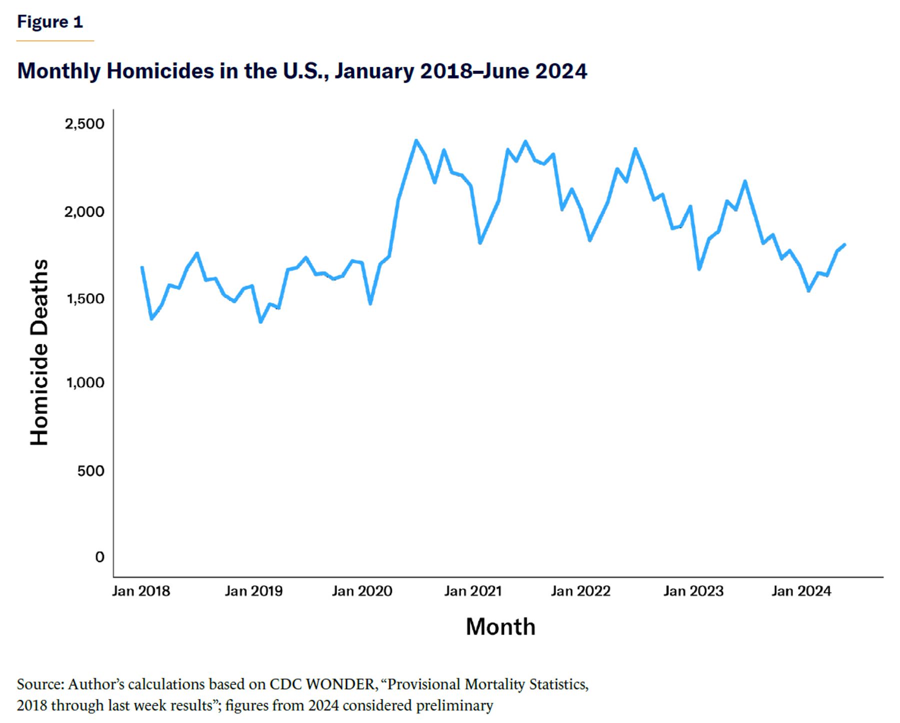
As Christos Makridis and I explained in a previous Manhattan Institute publication,[6] this overall spike tended to disproportionately affect demographic groups that already suffered high homicide rates. Homicide-rate increases tended to be roughly proportional to a group’s previous rate rather than a flat, across-the-board increase. Figure 2 breaks down annual homicide victimization rates by sex and race, two of the most pronounced demographic distinctions in American violence trends.
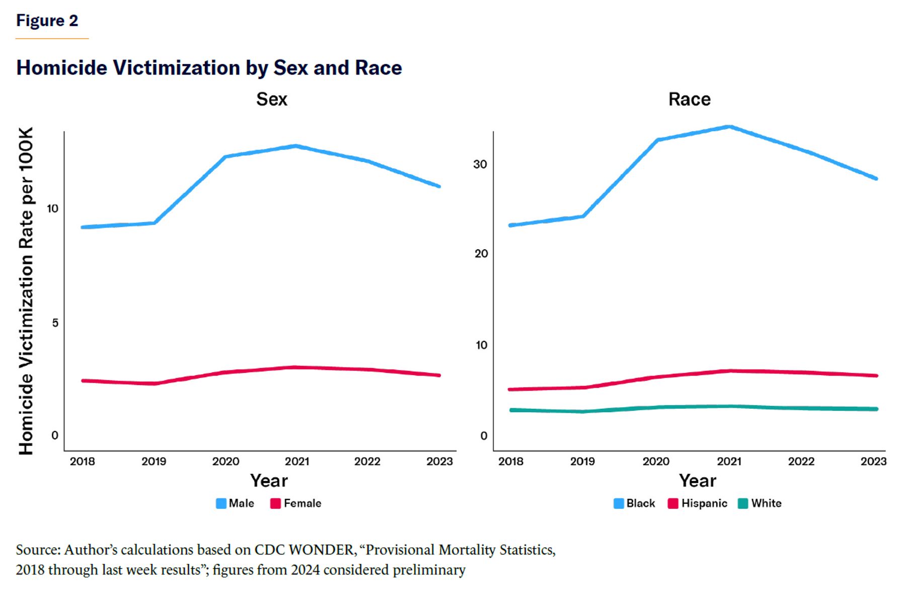
Informed by the patterns in Figure 1, this brief treats 2018–19 as the Baseline period, 2020–21 as the Spike period, and 2022–23 as the Recovery period. Combining the data this way helps minimize the impact of random fluctuations and focuses the analysis on the broadest trends. I will be highly attentive to the patterns in Figure 2, analyzing the numbers in ways mindful of the difference between proportional and raw changes in homicide rates.
City by City
Most law enforcement does not occur at the national or even the state level; it is executed by local authorities. As this brief explores how homicide trends vary across major cities, I turn to the data collected by their individual police agencies.
Starting with census data on city populations,[7] I assembled a list of cities with populations greater than 250,000 as of 2023. I then put together data reported by these cities’ police departments regarding their homicides during 2018–23. These numbers are predominantly drawn from the Real-Time Crime Index and the Uniform Crime Reports (in a few cases, they are sourced from police documents or news reports). Since city and agency boundaries do not always perfectly align, rates are calculated using the FBI’s population coverage numbers for each agency.[8] Note that, unlike the CDC numbers above, police statistics on homicide offenses focus on murder and nonnegligent manslaughter; they do not include, for instance, justifiable homicides.
Last, I examined the cities reporting at least 20 homicides in each of the Baseline, Spike, and Recovery periods, excluding, for example, Irvine, California, which saw a shocking tripling of its homicides between the Baseline and Spike periods—going from one homicide to three. My scope therefore includes 78 major U.S. cities.
City trends mirrored demographic group trends: those with the highest initial homicide rates generally also had the biggest spikes in per-capita terms, as illustrated in Figure 3. (Point sizes reflect city populations.) Once again, the increase in homicide was loosely proportional to the baseline.
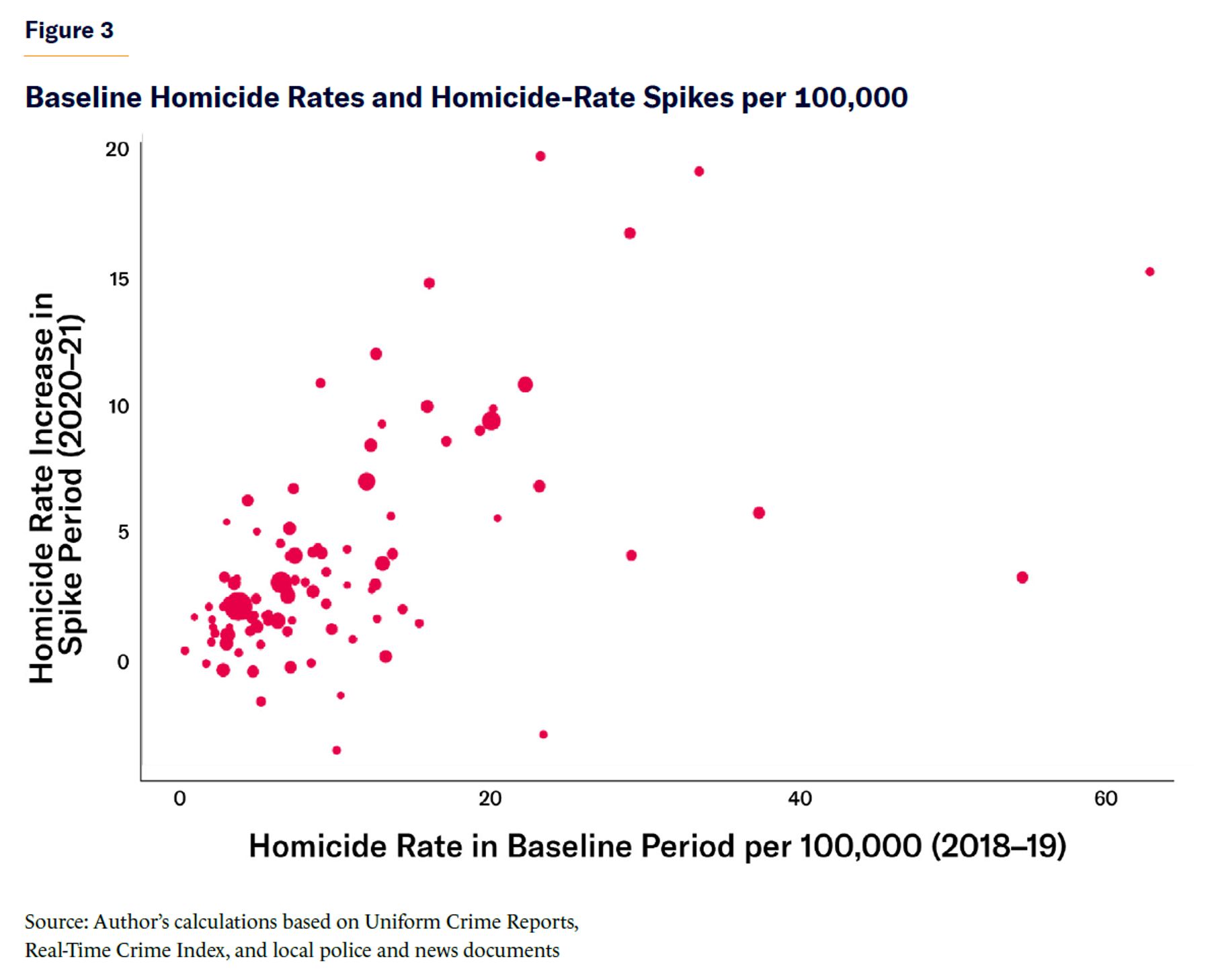
With this pattern in mind, I focused my analysis on cities’ proportional spikes in per-capita homicide rates, such that an increase from 4 to 8 per 100,000 is treated the same as an increase from 10 to 20, i.e., a doubling. As is evident from Figure 3, focusing on raw per-capita increases would largely highlight preexisting differences rather than anything particular to the subsequent spike and recovery. While underlying drivers of crime no doubt exacerbated this spike, it’s important to investigate why cities saw their homicide rates change in such different ways beyond that pattern.
Proportional changes are complicated to measure. An increase from 4 to 8 represents a 100% change. But if it goes back down to 4, that’s only a 50% change. This poses obvious problems for comparing how much cities’ homicide rates increased during the Spike period with how much they decreased during the Recovery period. Thus, I calculated percentage changes using the “midpoint method,” in which the difference between two numbers is divided by their midpoint rather than the starting value.[9] An increase from 4 to 8 and a decrease back to 4 are both changes of about 67%. (The difference of 4 is divided by the midpoint of 6.)
Table 1 shows all 78 cities’ proportional spikes and recoveries using this method, plus the raw homicide rates in all three periods and the average population of the area covered by its police department.[10] The cities are ranked according to the severity of their spikes, from greatest to least. Note that in both the Spike and Recovery periods, positive numbers indicate increases and negative numbers indicate decreases.
Table 1
Changes in Homicide Rates per 100,000 Across Baseline (2018–19), Spike (2020–21), and Recovery (2022–23) Periods
| Agency | Change in Spike Period (%, Midpoint Method) | Change in Recovery Period (%, MM) | Baseline Homicide Rate (2018–19) | Spike Homicide Rate (2020–21) | Recovery Homicide Rate (2022–23) | Average Population |
| Portland, OR | 85 | 24 | 4.2 | 10.5 | 13.3 | 650,490 |
| Minneapolis | 75 | –10 | 9.0 | 19.8 | 17.9 | 429,481 |
| Mesa | 74 | 12 | 2.7 | 6.0 | 6.7 | 515,512 |
| Lubbock | 68 | –22 | 4.8 | 9.8 | 7.9 | 262,636 |
| Louisville | 65 | –11 | 12.6 | 24.6 | 22.0 | 673,876 |
| Fresno | 63 | –43 | 7.2 | 13.9 | 9.0 | 541,172 |
| Milwaukee | 63 | 5 | 16.0 | 30.8 | 32.5 | 581,571 |
| Austin | 61 | 5 | 3.4 | 6.3 | 6.7 | 986,742 |
| Cleveland | 60 | –6 | 23.2 | 43.0 | 40.4 | 374,473 |
| Arlington, TX | 54 | –22 | 3.0 | 5.2 | 4.2 | 399,106 |
| Fort Worth | 54 | –22 | 7.0 | 12.1 | 9.7 | 934,782 |
| Toledo | 53 | –17 | 12.9 | 22.2 | 18.6 | 270,172 |
| Aurora, CO | 52 | 10 | 6.4 | 10.9 | 12.0 | 387,025 |
| Columbus | 51 | –26 | 12.2 | 20.6 | 15.9 | 907,018 |
| Indianapolis | 48 | –17 | 15.9 | 25.8 | 21.7 | 887,273 |
| Houston | 45 | –10 | 12.0 | 18.9 | 17.1 | 2,327,820 |
| St. Paul | 45 | –4 | 6.9 | 11.0 | 10.6 | 302,956 |
| Memphis | 45 | 1 | 29.0 | 45.8 | 46.4 | 640,670 |
| New Orleans | 44 | 17 | 33.5 | 52.7 | 62.5 | 384,259 |
| New York | 44 | –13 | 3.6 | 5.7 | 5.0 | 8,348,283 |
| Phoenix | 43 | 7 | 7.3 | 11.4 | 12.2 | 1,670,253 |
| Oakland | 40 | 9 | 17.1 | 25.7 | 28.0 | 432,358 |
| Bakersfield | 40 | –50 | 8.8 | 13.1 | 7.9 | 399,603 |
| Tucson | 40 | –16 | 8.5 | 12.7 | 10.8 | 544,748 |
| Omaha | 40 | –16 | 4.8 | 7.1 | 6.1 | 477,177 |
| Cincinnati | 39 | –25 | 20.2 | 30.0 | 23.3 | 305,427 |
| Philadelphia | 39 | –10 | 22.2 | 33.0 | 29.8 | 1,580,964 |
| Los Angeles | 38 | 1 | 6.4 | 9.4 | 9.5 | 3,927,437 |
| Chicago | 38 | –14 | 20.0 | 29.4 | 25.5 | 2,686,705 |
| Atlanta | 38 | 6 | 19.3 | 28.3 | 30.1 | 504,530 |
| Denver | 37 | –6 | 9.0 | 13.2 | 12.4 | 724,182 |
| Tampa | 35 | 2 | 7.3 | 10.4 | 10.6 | 399,119 |
| Greensboro | 34 | 0 | 13.5 | 19.1 | 19.1 | 299,005 |
| Stockton | 34 | –4 | 10.7 | 15.0 | 14.4 | 318,775 |
| Sacramento | 33 | –6 | 6.9 | 9.5 | 9.0 | 520,987 |
| Lexington, KY | 32 | –5 | 8.0 | 11.0 | 10.5 | 324,574 |
| Wichita | 31 | –36 | 9.3 | 12.8 | 8.9 | 395,211 |
| Riverside | 31 | –56 | 4.7 | 6.4 | 3.6 | 327,835 |
| Seattle | 31 | 25 | 4.5 | 6.2 | 8.0 | 758,201 |
| San Antonio | 31 | 36 | 6.8 | 9.3 | 13.4 | 1,536,672 |
| San Diego | 28 | –17 | 3.0 | 3.9 | 3.3 | 1,417,783 |
| Jersey City | 27 | –57 | 5.6 | 7.4 | 4.1 | 273,520 |
| Glendale | 27 | 12 | 5.4 | 7.1 | 7.9 | 253,009 |
| Charlotte | 27 | –9 | 8.5 | 11.1 | 10.2 | 954,151 |
| Albuquerque | 26 | 16 | 13.6 | 17.8 | 20.8 | 561,336 |
| Washington, DC | 26 | 16 | 23.2 | 29.9 | 35.3 | 693,605 |
| Dallas | 25 | 3 | 13.0 | 16.7 | 17.2 | 1,338,181 |
| Winston-Salem | 24 | 5 | 10.7 | 13.6 | 14.3 | 249,935 |
| Colorado Springs | 24 | 7 | 5.6 | 7.1 | 7.6 | 483,597 |
| Buffalo | 24 | –28 | 20.4 | 26.0 | 19.6 | 262,329 |
| San Francisco | 23 | 14 | 4.8 | 6.1 | 7.0 | 837,504 |
| Raleigh | 22 | 29 | 4.4 | 5.5 | 7.3 | 478,612 |
| Las Vegas | 22 | 10 | 6.2 | 7.7 | 8.5 | 1,671,244 |
| St. Louis | 22 | –20 | 62.7 | 78.0 | 63.6 | 294,586 |
| Nashville | 21 | –13 | 12.5 | 15.5 | 13.5 | 687,079 |
| Miami | 21 | –26 | 9.3 | 11.5 | 8.9 | 467,846 |
| Fort Wayne | 20 | –55 | 12.3 | 15.0 | 8.6 | 270,181 |
| St. Petersburg | 19 | –43 | 7.1 | 8.6 | 5.6 | 264,407 |
| San Jose | 19 | 1 | 2.9 | 3.5 | 3.5 | 1,011,162 |
| Long Beach | 15 | –13 | 6.8 | 7.9 | 7.0 | 459,038 |
| Detroit | 14 | –1 | 37.4 | 43.1 | 42.7 | 651,727 |
| Kansas City | 13 | 3 | 29.1 | 33.2 | 34.2 | 501,348 |
| Tulsa | 13 | –36 | 14.3 | 16.2 | 11.3 | 405,401 |
| Durham | 12 | 9 | 12.6 | 14.2 | 15.6 | 285,516 |
| Oklahoma City | 11 | –17 | 9.7 | 10.9 | 9.2 | 673,142 |
| Santa Ana | 10 | –9 | 5.1 | 5.6 | 5.1 | 324,752 |
| Pittsburgh | 9 | 17 | 15.4 | 16.8 | 19.8 | 304,064 |
| Orlando | 7 | –15 | 11.1 | 11.8 | 10.1 | 300,156 |
| Baltimore | 6 | –9 | 54.5 | 57.7 | 52.6 | 585,667 |
| Jacksonville | 1 | 2 | 13.2 | 13.3 | 13.5 | 928,752 |
| Corpus Christi | –2 | 16 | 8.4 | 8.2 | 9.6 | 324,926 |
| Boston | –5 | –7 | 7.0 | 6.7 | 6.2 | 679,574 |
| El Paso | –11 | 3 | 4.6 | 4.1 | 4.2 | 683,360 |
| Newark | –14 | –27 | 23.4 | 20.4 | 15.6 | 291,517 |
| North Las Vegas | –15 | 6 | 10.3 | 8.8 | 9.4 | 265,512 |
| Honolulu | –18 | 13 | 2.7 | 2.2 | 2.5 | 986,602 |
| Virginia Beach | –39 | 24 | 5.1 | 3.4 | 4.4 | 452,397 |
| Anchorage | –44 | 33 | 10.0 | 6.4 | 8.9 | 288,070 |
Source: Author’s calculations based on Uniform Crime Reports, Real-Time Crime Index, and local police and news documents; percentage changes calculated using the midpoint method
Standout Cities
It’s useful to tour these findings, paying special attention to how well the most affected cities recovered after their Spike periods.
The Unsurprising: Minneapolis, second only to Portland, was home to the George Floyd killing and the epicenter of unrest. The city suffered one of the nation’s largest homicide increases, and afterward recovered only slightly. Despite its increase in homicides, the city still has a rate well below cities such as St. Louis or Baltimore. And fortunately, early 2025’s numbers for the city have been positive.[11]
Weak Recoveries: In some cases, elevated homicide rates during the Spike period remained high, or even continued increasing in the Recovery period. This is especially worrisome in cities with high baseline homicide rates. Four cities had baseline homicide rates above 15 per 100,000, spikes of at least 40%, and recoveries of less than one-third: Cleveland, Memphis, Milwaukee, and New Orleans. Also notable is Portland, which, while starting from a low baseline, saw the largest homicide spike in proportional terms, followed by even more growth as the nation as a whole recovered. The city redirected police funding and cut a gun-violence prevention team in 2020 owing to worries about racial disparities,[12] and it has suffered a subsequent police-staffing crisis as well (the subject of an earlier Manhattan Institute report from Charles Fain Lehman).[13] As with Minneapolis, however, these cities—especially New Orleans—appear to be on a better trajectory, according to more recent data.[14]
Strong Recoveries: St. Louis nearly fully recovered, but to an extremely high baseline; indeed, it has the highest homicide rate in the sample across all three periods. Numerous cities experienced spikes of at least 20% but recovered to within 10% of their starting values, including Miami, Buffalo, and Nashville.
Cities with No 2020–21 Homicide Spike at All: Notably, two of the three lowest rankings, Anchorage and Honolulu, are outside the continental U.S.; this may suggest a certain immunity to cultural dynamics that prevail among the 48 contiguous states. Newark also stands out for continuing improvement that began well before the pandemic and was not interrupted by it. Reforms included significant investments in violence-prevention programs.[15]
Baltimore: The second-highest baseline homicide rate in the data (54 per 100,000, behind only St. Louis) is Baltimore’s, which barely experienced a spike and therefore ranks toward the bottom of the list. However, Figure 4, drawing from monthly FBI data, shows that following the April 2015 death of Freddie Gray, Baltimore homicides skyrocketed and remained high until the beginning of the main data set used in this brief. To capture the discontinuity at this month, each point depicts 12 months’ worth of homicides beginning in April, rather than January, of the year in question.
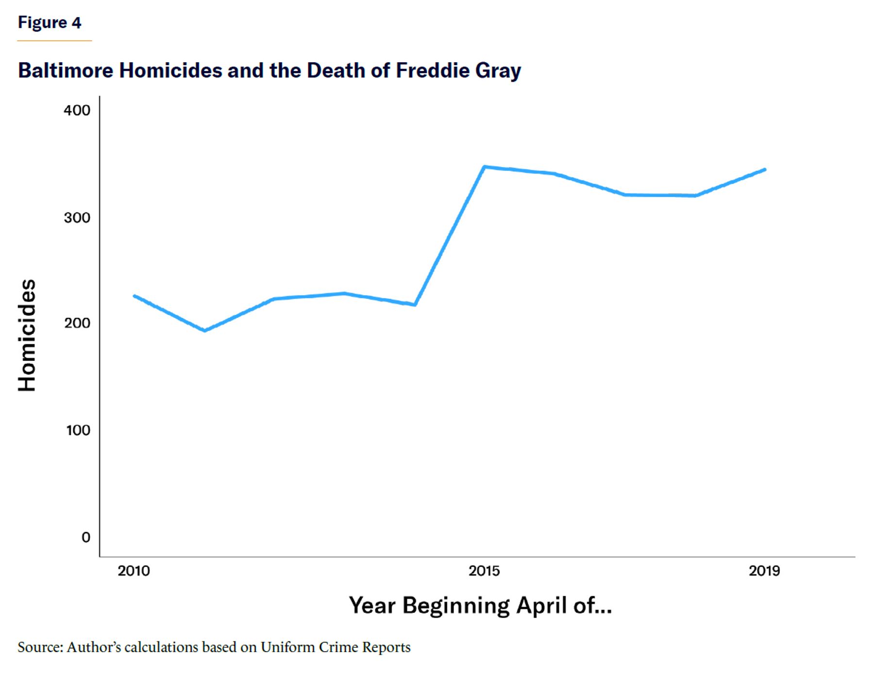
Baltimore’s spike began five years before that of other cities and never receded, but it has managed to avoid becoming much worse. Like many other cities, Baltimore has been enjoying a significant decline, according to more recent data.[16]
Looking for Patterns: Race, Cops, and Idleness
Starting with the aforementioned data, it is worth exploring the data set for correlations with theorized mechanisms for recent homicide trends—bearing in mind, of course, the difference between correlation and causation, as well as the limits of aggregating data into two-year periods.
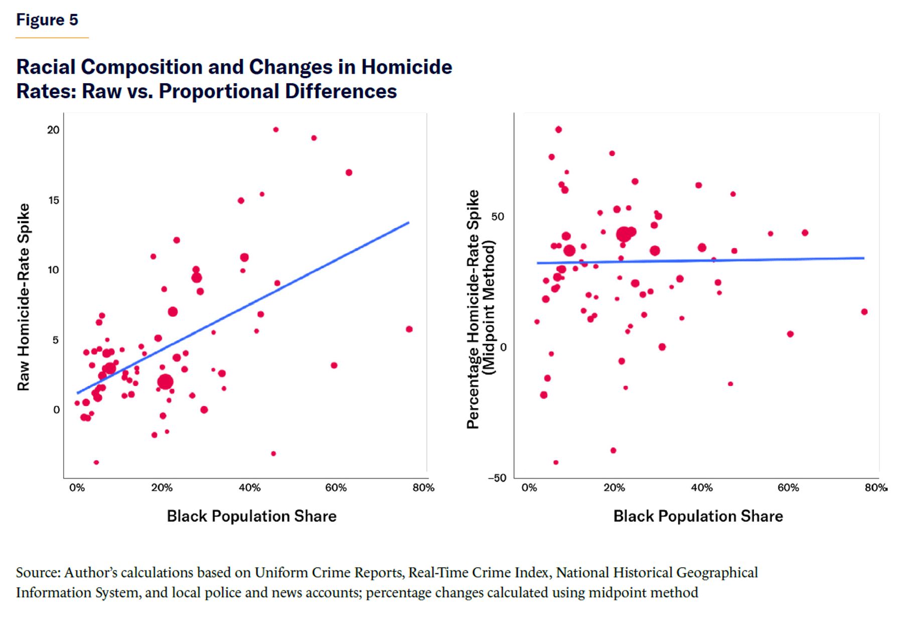
Given the racial tensions driving 2020’s violent summer and given that nationwide, black Americans suffered an especially severe homicide spike—with a 35% increase to their victimization rate between 2019 and 2020, versus about 20% for whites[17] (to say nothing of the even more dramatic per-capita contrast presented in Figure 2)—it’s worth asking whether cities with higher black populations were also more adversely affected. It’s possible to match nearly all my agencies[18] to demographic data from the cities in question.[19]
As Figure 5 depicts, black population share is associated with raw homicide-rate increases during the Spike period—but importantly, not with proportional increases. The key observation is that demographics and places with higher initial homicide rates both predicted bigger spikes. But once that pattern is accounted for by focusing on proportional increases, black population share loses its predictive power.
Previous research suggests a two-way relationship between policing and the homicide spike. Rigorous studies suggest that homicide rates are strongly responsive to policing levels, with one effort suggesting that a 1% increase in police levels corresponds to a 0.67% decrease in homicides.[20] Police activity plummeted during the pandemic,[21] of course; and in the wake of the Floyd protests, urban departments experienced increased turnover,[22] with news reports of their officers leaving for suburban jobs.[23] A reduction in policing can cause crime rates to rise, and the political situations unfolding in most crime-racked American cities might have caused cops to leave.
Thus it’s not surprising that, in Figure 6, there’s a noticeable, if hardly perfect, relationship between changes in police staffing and changes in homicide rates between the Baseline and Spike periods. This chart includes cities with full 2018–23 staffing data available in the FBI’s Law Enforcement Employees data set, excluding Las Vegas, owing to irregularities in that agency’s numbers.[24]
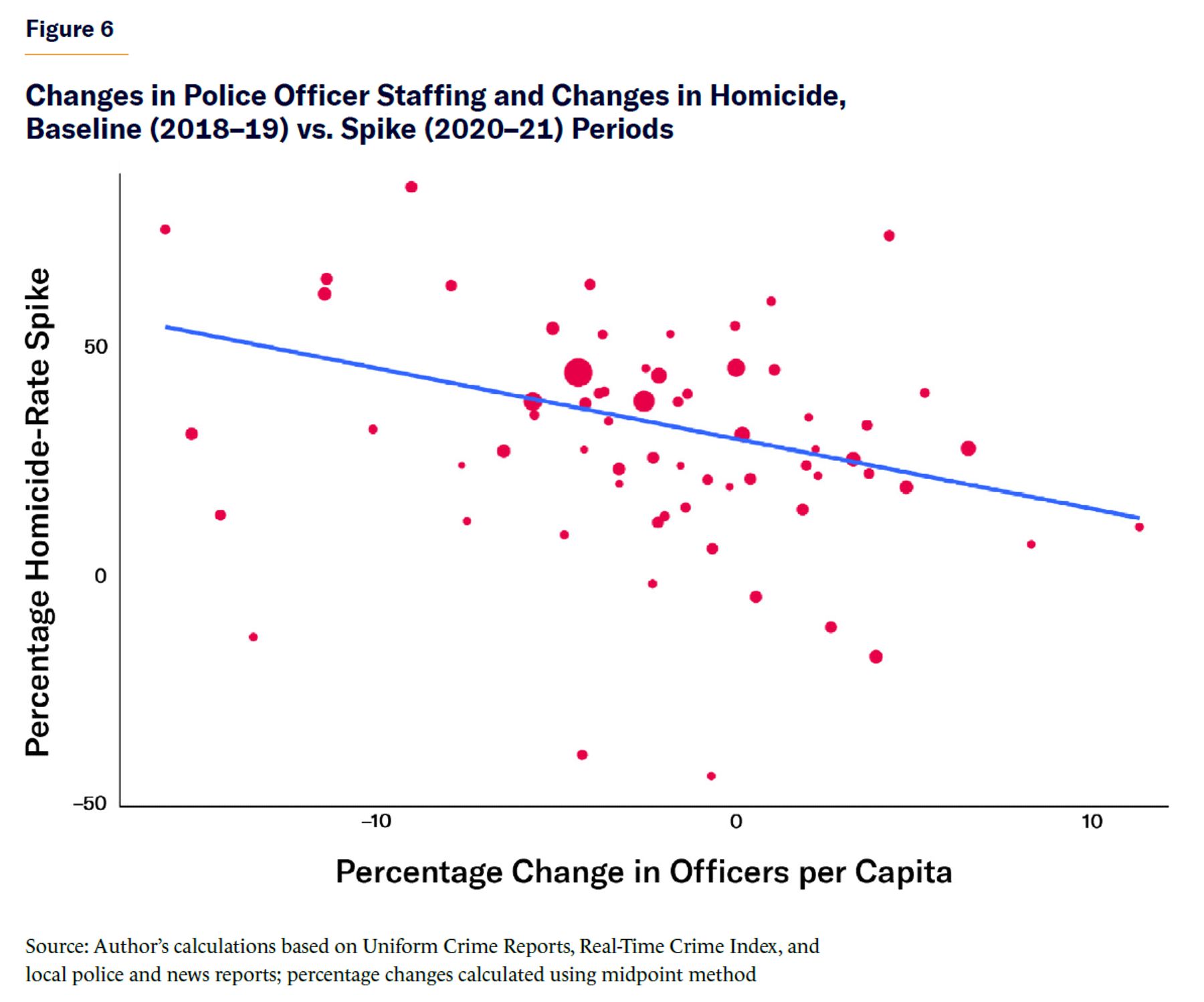
The relationship between policing and homicide rates is weaker and statistically insignificant when comparing changes between the Spike and Recovery periods. I also find insignificant results when comparing changes in per-capita arrests with changes in homicide rates among the 49 cities with full arrest data available from the FBI, though, of course, this analysis is less precise.[25] Regardless, the results are insignificant for both the Baseline vs. Spike and Spike vs. Recovery comparisons, and whether the arrest changes are raw or proportional. In that case, the two-way relationship is more complicated. More arrests can reduce crime, but rising crime leads to more arrests. The FBI’s national data-collection efforts do not include police stops, though research from Paul Cassell has leveraged several departments’ data to show that stops decreased during the first months of Covid and again following the Floyd protests.[26] A study by Dae-Young Kim concluded that in New York, “the increases in gun, non-domestic, and gang homicides were significantly associated with decreased police stops in the wake of the pandemic and Floyd protests.”[27]
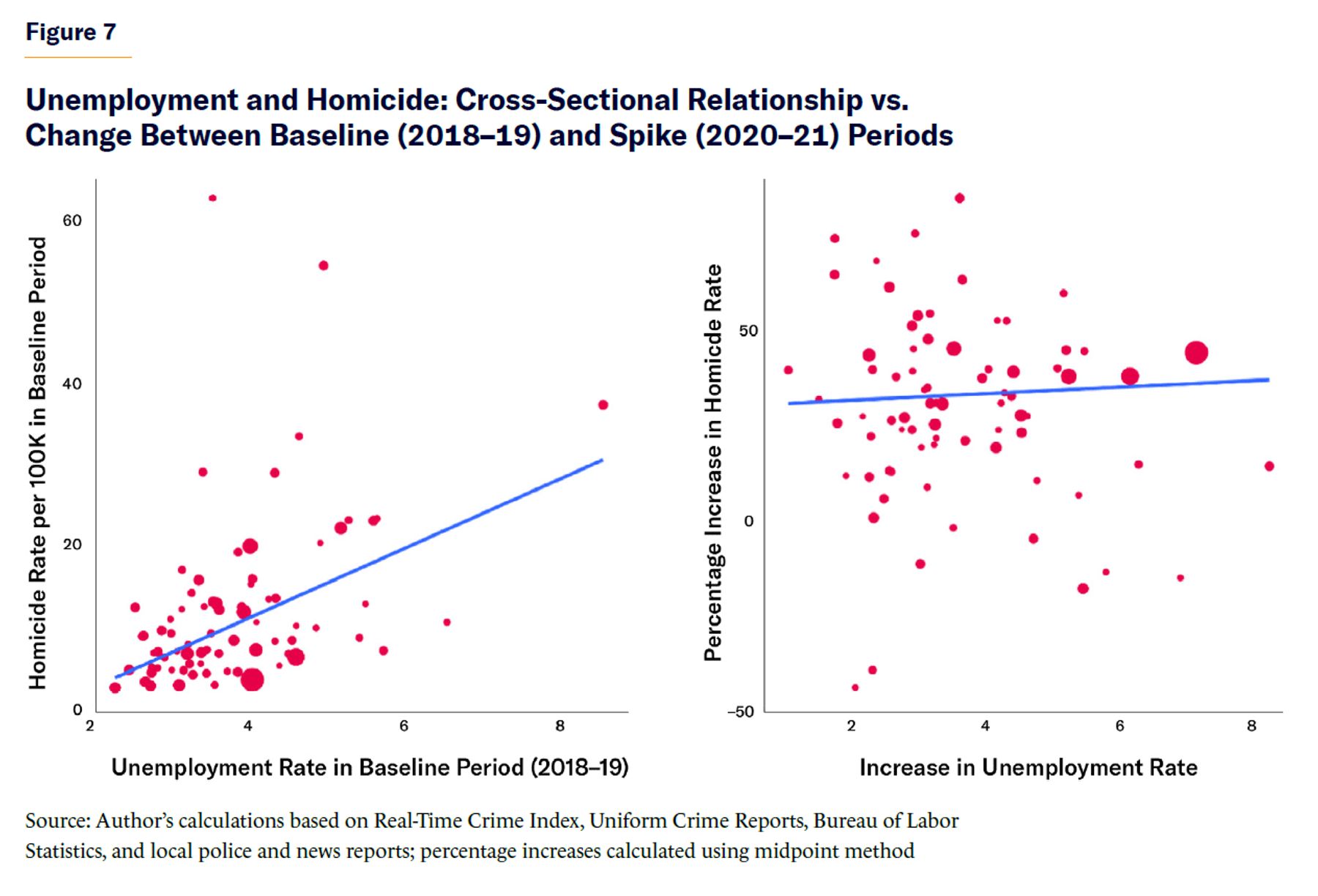
Rising unemployment rates have been another common explanation for homicide spikes. A study by Julia Schleimer et al. tentatively linked pandemic unemployment growth in 16 cities with gun violence and homicide during the summer of 2020.[28] A Brookings Institution analysis of 32 cities linked homicide increases to the combination of unemployment and school closures in neighborhoods with concentrated poverty.[29] The latter study measured raw, rather than proportional, homicide increases and compared them with the share of the total population comprising young males who were simultaneously living in concentrated poverty and removed from work or school. Thus, it might, to some extent, have simply picked up the pattern that spikes were bigger in places with already-high homicide rates (which are disproportionately places with high concentrated poverty as well).[30]
The data in this report offer a broader, complementary look at the issue.[31] As Schleimer et al. noted, “Despite well-established cross-sectional associations between socioeconomic status and violence, and theories linking the two, evidence is mixed as to whether population-level rates of violence are sensitive to changes in economic conditions.” Indeed, as Figure 7 shows, while there is a solid cross-sectional correlation in the Baseline period between average monthly unemployment and homicide rates (which looks similar in the Spike and Recovery periods as well), the relationship between changes in these variables between the Baseline and Spike periods is small and statistically insignificant.[32]
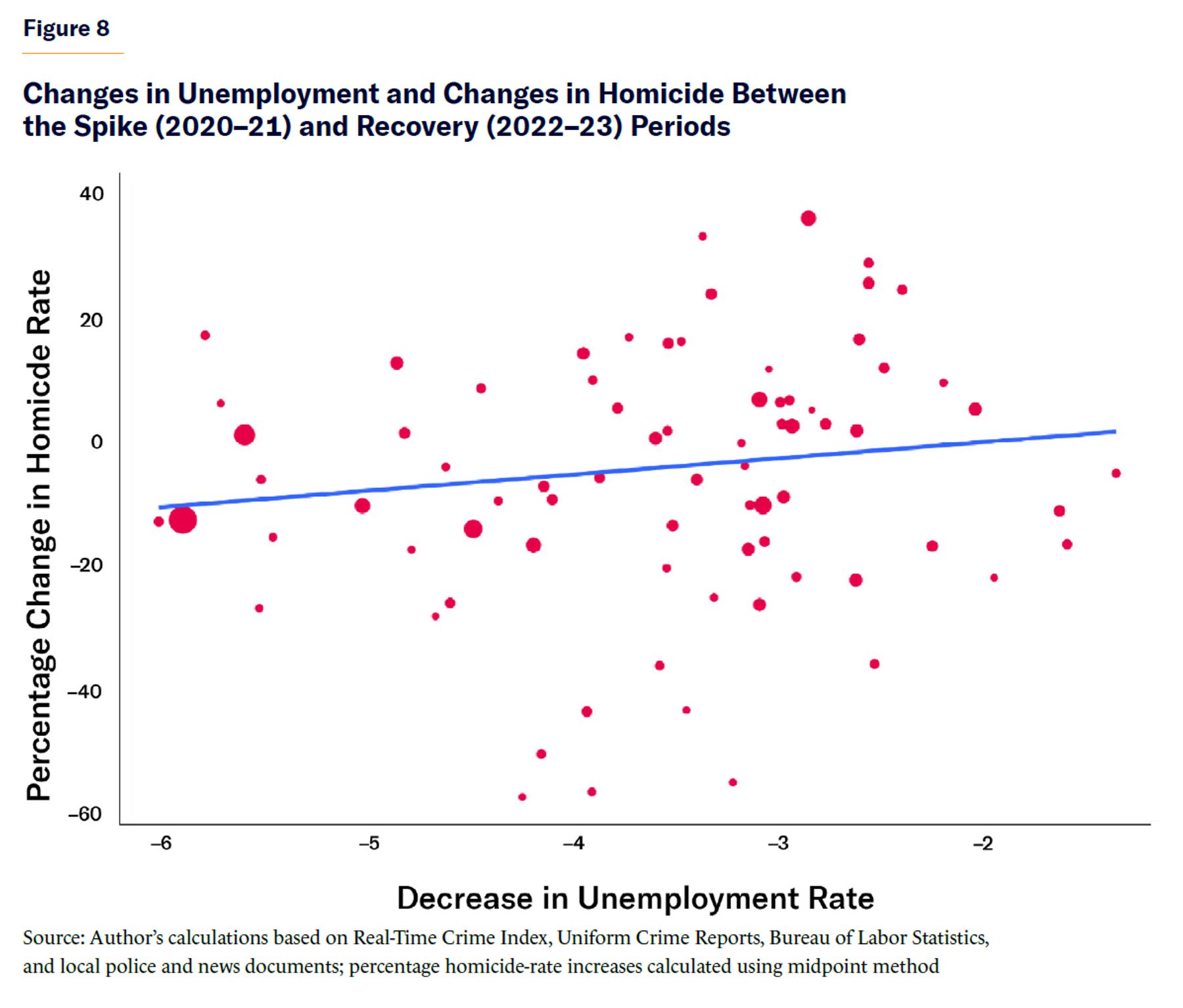
However, if one repeats the analysis from the right panel of Figure 7 for changes between the Spike and Recovery periods, and drops outlier Detroit (which had an especially drastic unemployment reduction measured in raw terms), the relationship is in the expected direction and statistically significant at the 10% level, depicted in Figure 8. This could suggest that there were public-safety benefits to a strong bounceback from the Covid recession, though, as with policing, the correlation here is far from perfect.
Unfortunately, my data set is not well suited to studying school closures, another proposed mechanism behind homicide trends.[33] Given clear evidence that virtual learning reduced academic progress[34] and increased chronic absenteeism,[35] it conceivably could have contributed to lethal violence as well. However, a study based on self-report surveys suggests that youth engaged in less crime during the pandemic, “in part due to reductions in how frequently youth attended parties, went out with friends for fun, drank alcohol, or used cannabis,” and that places with higher rates of school closures saw greater reductions in property crime committed by youth, though not violent crime.[36]
Idleness patterns, like policing patterns, were dramatically altered across the U.S. during the pandemic, and their relationship to homicide trends should be studied further. But variations in these patterns are only partial explanations for variations in proportional homicide trends.
Conclusion
From the foregoing exercise, a clear pattern emerges: homicide spikes tended to be most severe in the places and among the demographic groups that already had high homicide rates. This discovery is important, but it presents a challenge for deeper study of the issue. The seemingly trivial question of measuring proportional versus raw increases in the homicide rate will drastically affect which other variables are correlated with the increase.
When focusing on variation in proportional increases, most explanations seem relatively weak. There is some evidence, however, suggesting that policing and unemployment both play a role—evidence broadly consistent with previous research conducted on those topics. In the event of future social upheaval, policymakers should concentrate additional anticrime efforts on places that already have elevated rates of violence—and carefully consider, given the cause of the upheaval and the facts on the ground, any trade-offs that remove people from work or school or that reduce policing.
Endnotes
Photo: FireAtDusk / iStock / Getty Images Plus
Are you interested in supporting the Manhattan Institute’s public-interest research and journalism? As a 501(c)(3) nonprofit, donations in support of MI and its scholars’ work are fully tax-deductible as provided by law (EIN #13-2912529).